Note: Last night and early this morning, we got a number of e-mails from people who wanted to take advantage of the half-off sale last week, but who were out of town for Spring Break. So, starting at 4pm today – for 8 hours ONLY, you can take advantage of the Easter sale.
Just enter BUNNY (as in “Easter Bunny”) in the Special Code field on the top, right-hand side of your shopping cart. Now on to today’s info:
Today I want to talk about using pictures or photos in your promitions, and the best ways of using them — at least, in my experience.
1. Make sure you use them in the first place
You should use pictures or photos in all your prmoitions. I’ve never seen any situation where using (the right) picture or photo, hasn’t boosted response.
And if you think about it, you can see the evolution of this, as you moved from adwords, to banner ads, and then… even getting smaller in size — ads on facebook or CPA ads that all have a small photo on them.
In fact, most of the people I know who are using these ads, can get a lot more mileage out of the ads, just by swapping out the photos. Sure, at some point… the text of the ad itself, is going to start losing it’s effectiveness. But if your ad is good, that’ll happen long AFTER you’ve gone through sometimes dozens of photos.
2. Don’t fit in. The most important emotional buy-button to push, is…
Curiosity.
Not enough people give this any consideration, at all. Most people try and show off or they want to fit in, or they’re very preoccupied with making sure the ad convey’s the right “message.”
But you ad will pull MUCH a better response — especially when you’re trying to generate leads (online OR offline) — if you focus on “curiosity.”
You want to use an ad that’s going to make people as curious as possible.
So this means, if you’re selling a cookbook, for instance. Most people (and again, we’re talking about lead generation here, not your actual sales letter) would have photos of beautiful cakes, or mouth-watering dishes like steak and potatoes with fresh asparagus or vegetables parmesan with seasonings.
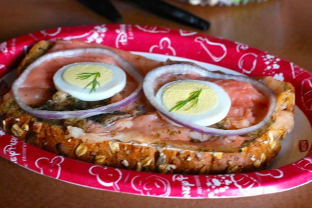
But if I were running that campaign, I’d probably have a photo of a meal that looks like the “recipe from hell,” with a caption underneath that says, “To avoid making this ONE cooking mistake nearly EVERYONE makes – make SURE you read page 177.”
Why?
The answer is simple. Everyone is expecting the picture of the nice-looking cake. And although that’s interesting… it’s not going to make you curious.
Intersting isn’t good enough – insanely curious is.
Destructo-meal is going to make you incredibly curious, and your immediate reaction to this, will be to resolve your curiousity by responding to the message.
So think about what makes your buyers curious — not what impresses them or what makes you look wonderful.
Sure, on your actual sales letter you can use some pictures like that, but not on your lead generation stuff. For lead gen, curiosity is King.
(Look at the photo on today’s blog posting to see what I mean.)
3. Lastly, for your sales material, consider using pictures of either your product or service in use… or the after-effects.
So for isntance, if you’re selling discount tickets to Gatorland (it’s in Orlando), use photos of people enjoying the amazing exhibits. Show people being startled by alligators jumping up out of the water, and how much fun they’re having.
You want your buyers to imagine how much better they’re going to be, with you in their life.
So remember — in many situations, photos are like “before and after” visual testimonials.
As long as you use them right, that is.
OK, that’s it for today. Don’t forget the extension of the half-off sale from 4-12 PM tonight – this is ABSOLUTELY it though.
I’ll send you an e-mail at 4pm to remind you and with the codes (that will same as before)
Now go sell something, Craig Garber
P.S. Instant Download: 12 NEW Special Reports, now yours FREE
How To Make Maximum Money With Minimum Customers – LIFETIME Guarantee Included
How To Make Maximum Money With Minimum Customers – Amazon.com
listening to: Broken Wings – Atomic Rooster (1970)
